Redesigning the Smallcase home page for improved discoverability
Made for
smallcase, an Indian fintech company with ~10 million users, providing baskets of stocks to reduce the barrier of entry into the stock market.
Made in
3 months
Responsibilities
User Research, UX Design, Competitive Analysis, Wireframing and Iterative Prototyping
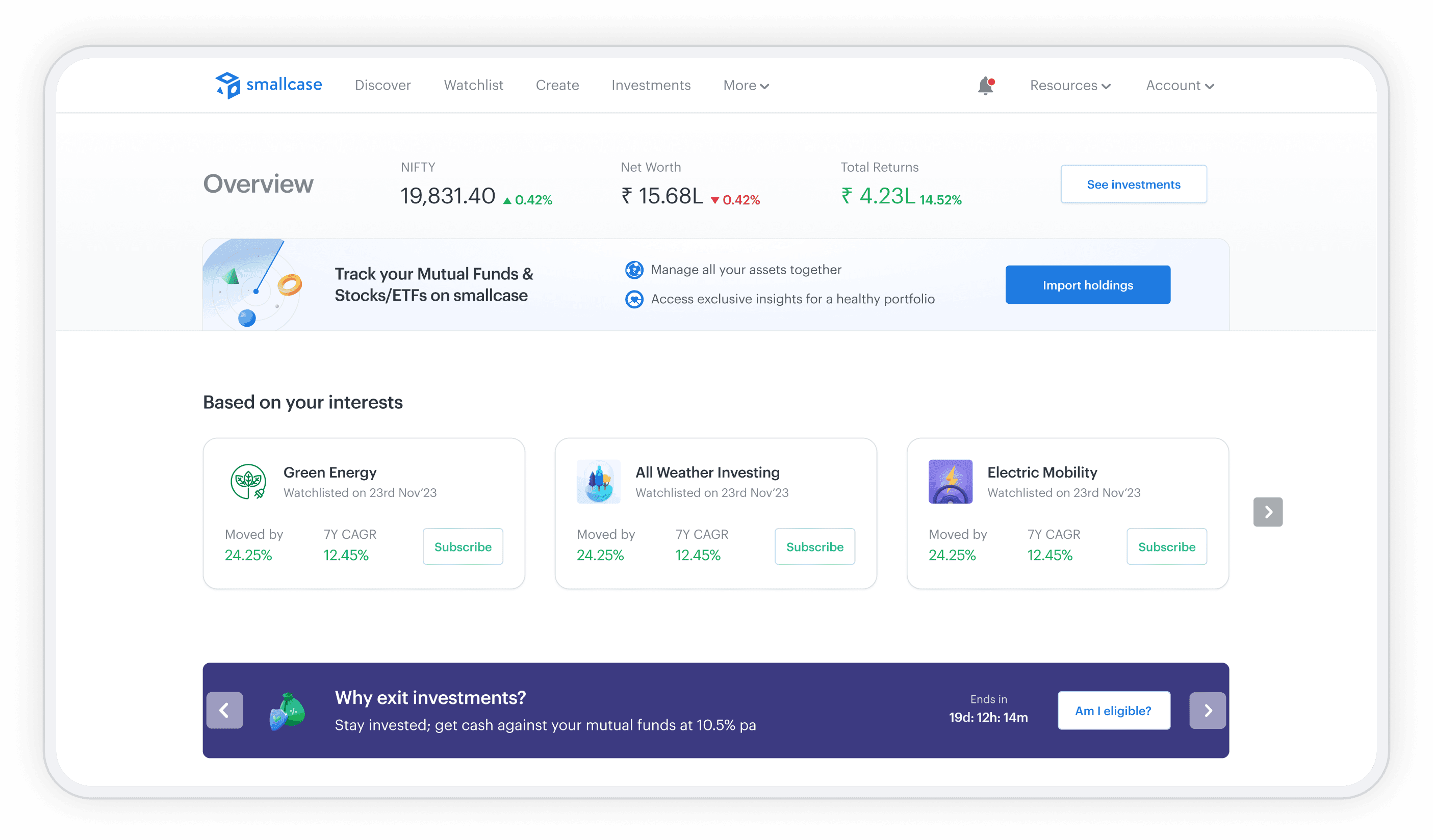
The redesigned smallcase home page in a browser window

Why redesign the home page

The existing home page lacked clear tools to guide discoverability of relevant investment products.
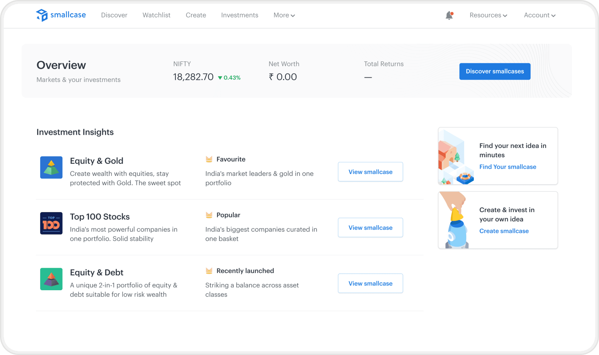
The original smallcase.com dashboard before the redesign

Limited & static suggestions

Unpersonalized & repetitive options

Niche and complex feature

Original dashboard of smallcase.com

So I made

A personalized home page that guides product discovery through relevant investment options.
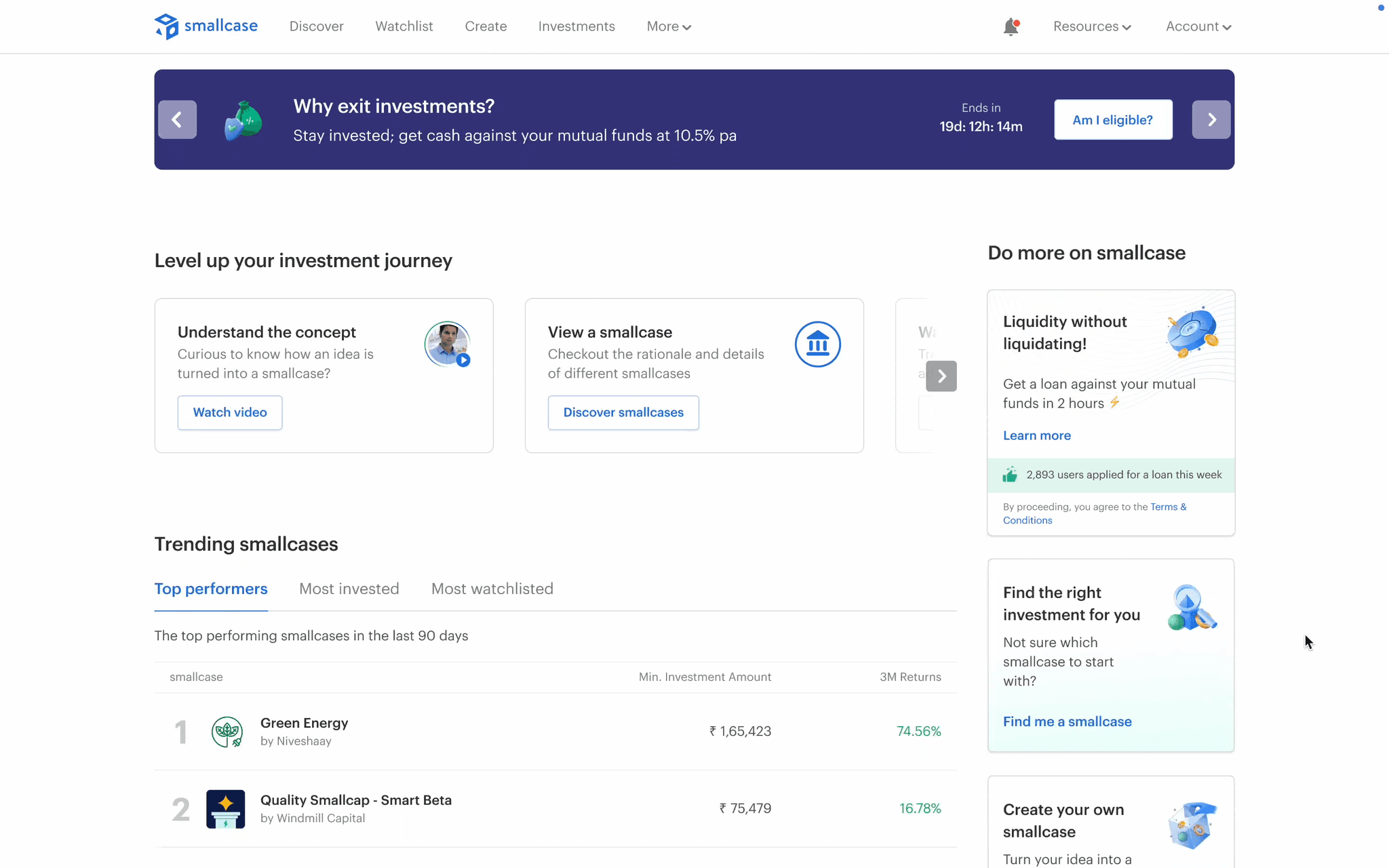
Walkthrough of the redesigned smallcase home page

What we aimed for

This overhaul aimed to drive more traffic through the website leading to...

20%
increase

in new user investments on the website

15%
increase

in subscriptions through this channel

20%
increase

in watchlisted portfolios

Decoding user research

After conducting 8 user interviews, I found users, like Josh, wanted better guidance that facilitated their investment journey.

Memoji avatar of Josh, the persona

This is Josh

A 27 year old engineer, can invest ₹20k per month

Started investing with Mutual Funds

He wants to build wealth for his future, for which…

He wants to diversify with stock baskets that give high returns

He would like know popular trends and themes to invest in

He needs guidance on how to start investing with the platform

Areas of focus

The goal of the redesign was to address the evolving nature of users' investment needs by providing options for each stage.

Explore

Learn about the market

Start with basic low-risk investments

Diversify

Go for higher returns

Invest in niche themes

Maintain

Maintain portfolio regularly

Update ratios according to goals

Most impactful areas to address to increase revenue

Let’s see how the new home page aids Josh in his product discovery process

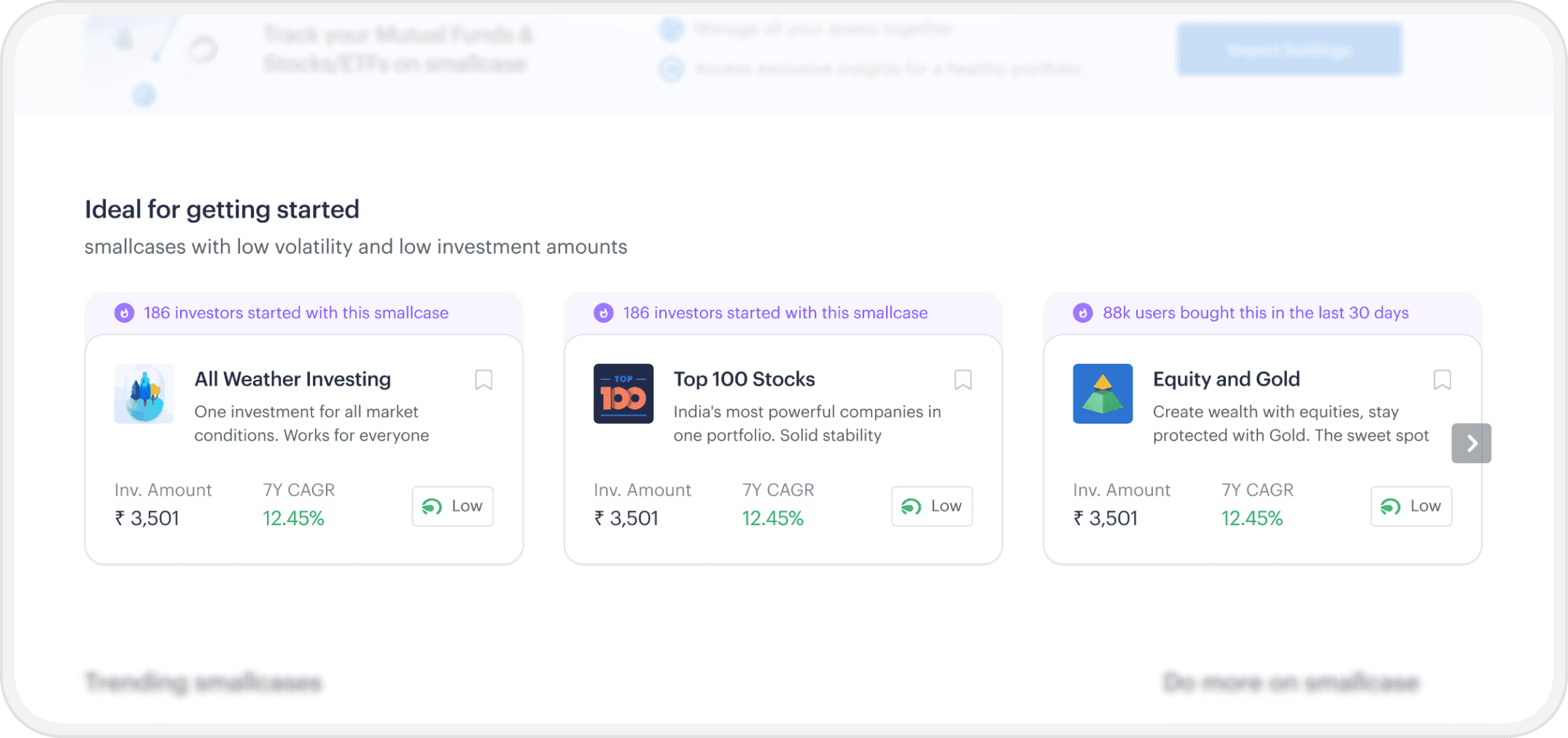
On logging in, Josh is looking to start with something with low stakes.

The first fold of the website contains portfolios that are simple bets to begin investing with.

According to user research, new users trust smallcase’s suggestions, so we showcased a pre-set list of beginner-friendly investments.

First fold of the redesigned home page with beginner-friendly portfolios

Why these portfolios are suitable for beginners

Social proof to highlight the popularity amongst new investors.

Users nudged to start with watchlisting, which is a low friction action.

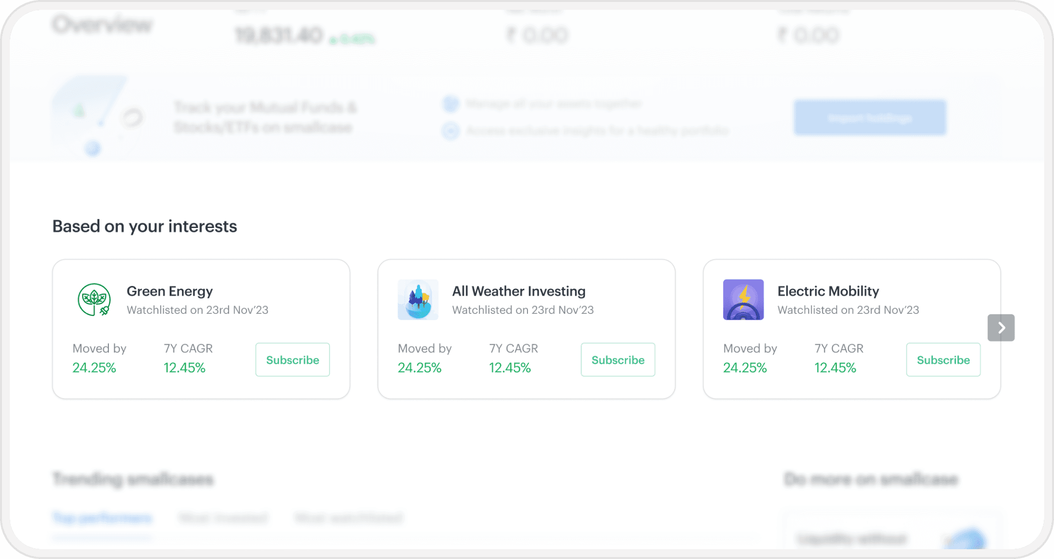
He explores various portfolios and even watchlists some to track their progress.

When he revisits the website, he will be able to track portfolios that he has engaged with and can choose to invest in them.

Home page section tracking Josh's watchlisted portfolios

Placed in first fold, most relevant suggestions

The portfolio’s growth since interacting to track performance for faster decision making.

More concrete actions shown as the user is familiar with these products.

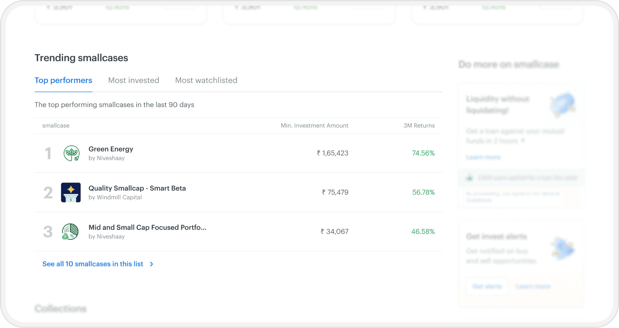
After Josh is comfortable with the platform, he wants to know the most in-demand portfolios.

I added a “Trending” section that ranks the top portfolios of the platform based on their performance and popularity.

Trending section ranking the platform's top portfolios

Tabs to let users interact and look at multiple lists

Progressive disclosure used to spark interest in trending smallcases

Tabular layout allows easy comparison of returns

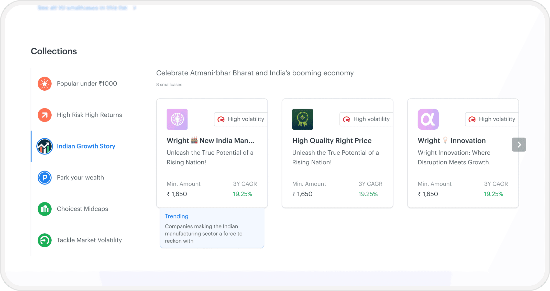
Josh has recently learned that India’s infrastructure boom is a great theme to invest in for the future.

For exploring specific investment themes or ideas, I introduced a “Collections” section that aids categorical discovery of investments.

Collections section grouping portfolios by investment theme

Tabs to allow quick navigation for easier comparison

Nudges that highlight the unique features of the portfolio.

All portfolios shown up front instead of hiding them behind a touchpoint.

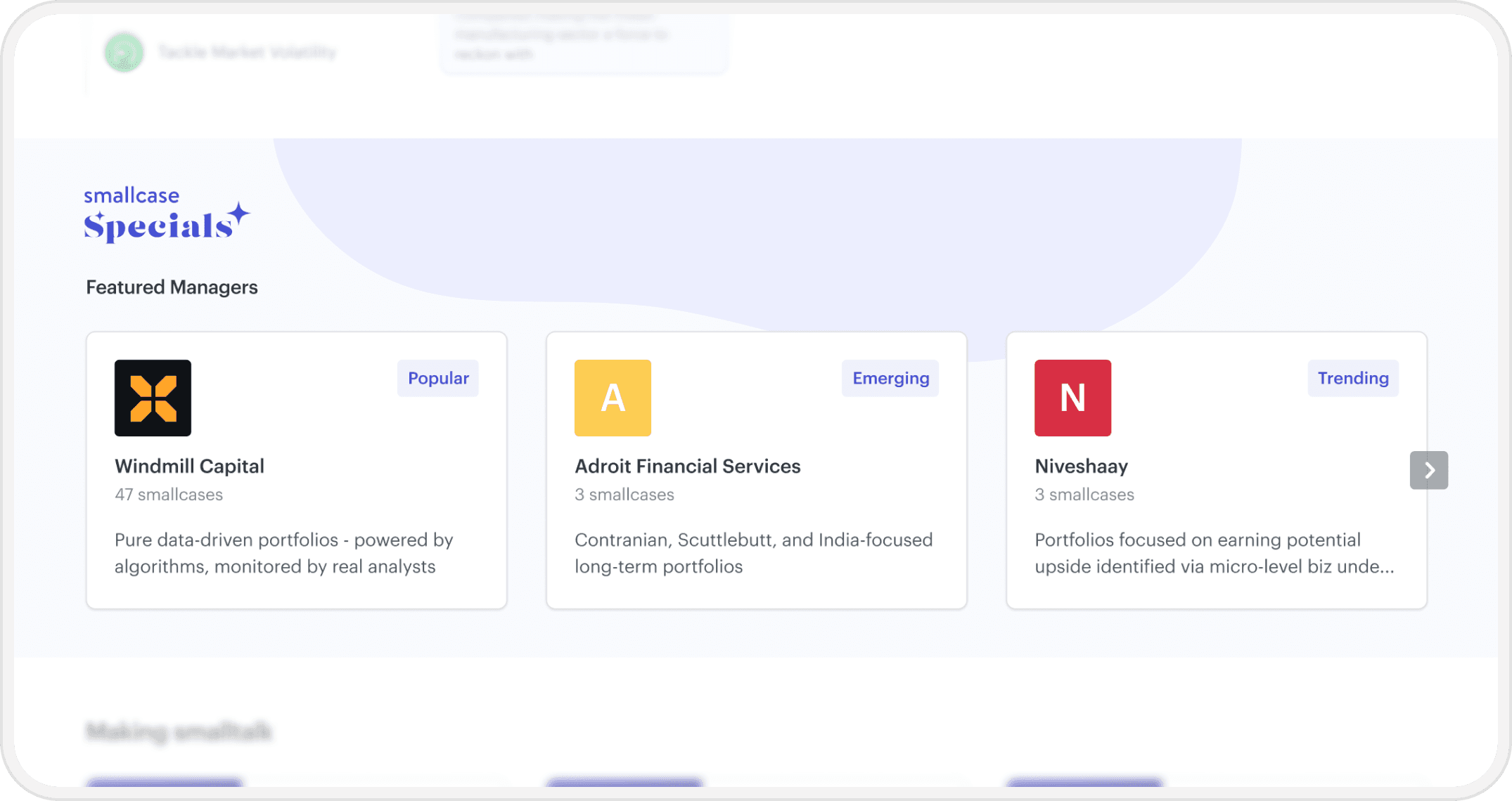
Josh has also started following some investment managers who provided portfolios on smallcase.

Surfacing star-managers makes their followers’ discovery journey much smoother.

Investment advisors in India often garner a big following on social media. Marketing analysis informed us that their followers follow them to the platform and look for their products.

Section spotlighting star investment managers and their portfolios

Other additions to the page

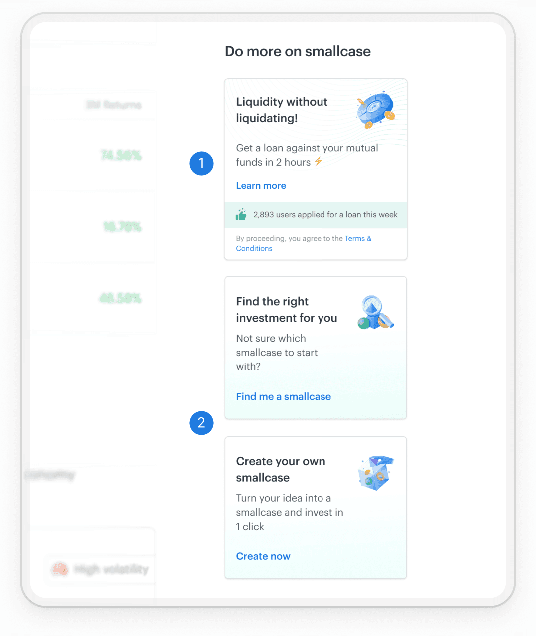
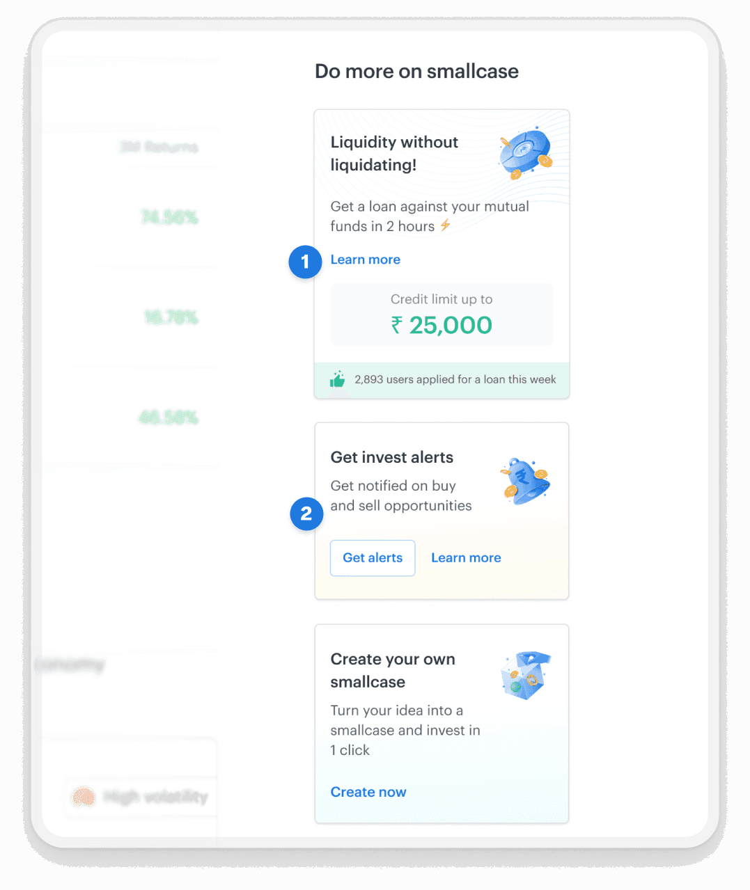
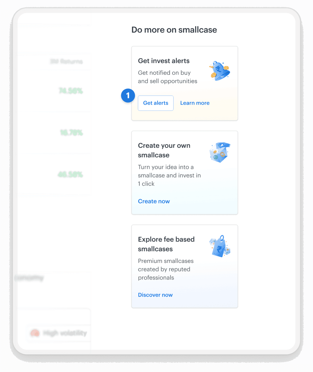
This redesign also gave the team an opportunity to better surface other product offerings.

We showcased the platform’s various affordances to a user in a way that's most relevant to them.

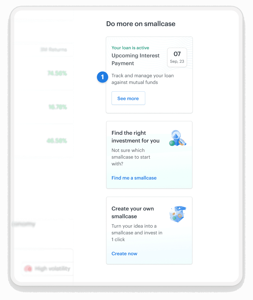
This helped promote products like external investment tracking, loans alerts, etc. to a broader audience.

User new to the website

Loan offerings are prioritised from a business perspective. Tools to make first investment are shown.

Invests in portfolios and tracks external investments

Takes a loan from smallcase

Loan instalment coming up

During research, I also found that new users generally struggled to make sense of the platform.

So, I created a step-by-step guide to acclimatise new users to the concept of portfolio based investing.

Step-by-step guide walking new users through portfolio based investing

Results and reflections

A phased rollout was planned for this redesign.

While this continued to be a prioritized project, I was not able to see through the execution of the whole redesign as I left the company to pursue my masters degree.