Smallcase Checkout is

A customizable payment experience used by various financial products

Made for
smallcase, an Indian fintech company with ~10 million users
Made in
3 months
Responsibilities
Drove the design and testing of the project, collaborated with PMs, Business and Developers

What’s smallcase?

smallcase is an all-in-one financial app that offers portfolios of stocks, fixed deposits & mutual funds to help people build a stable portfolio and grow their money.

Why did we need a new checkout?

As the company was expanding to newer products, we identified a need for a centralized payment flow.

Before
SubscriptionsLoan repaymentsInvestments
Payment flow 1Payment flow 2Payment flow 3
After
SubscriptionsLoan repaymentsInvestments
Centralized
payment flow

So, I made

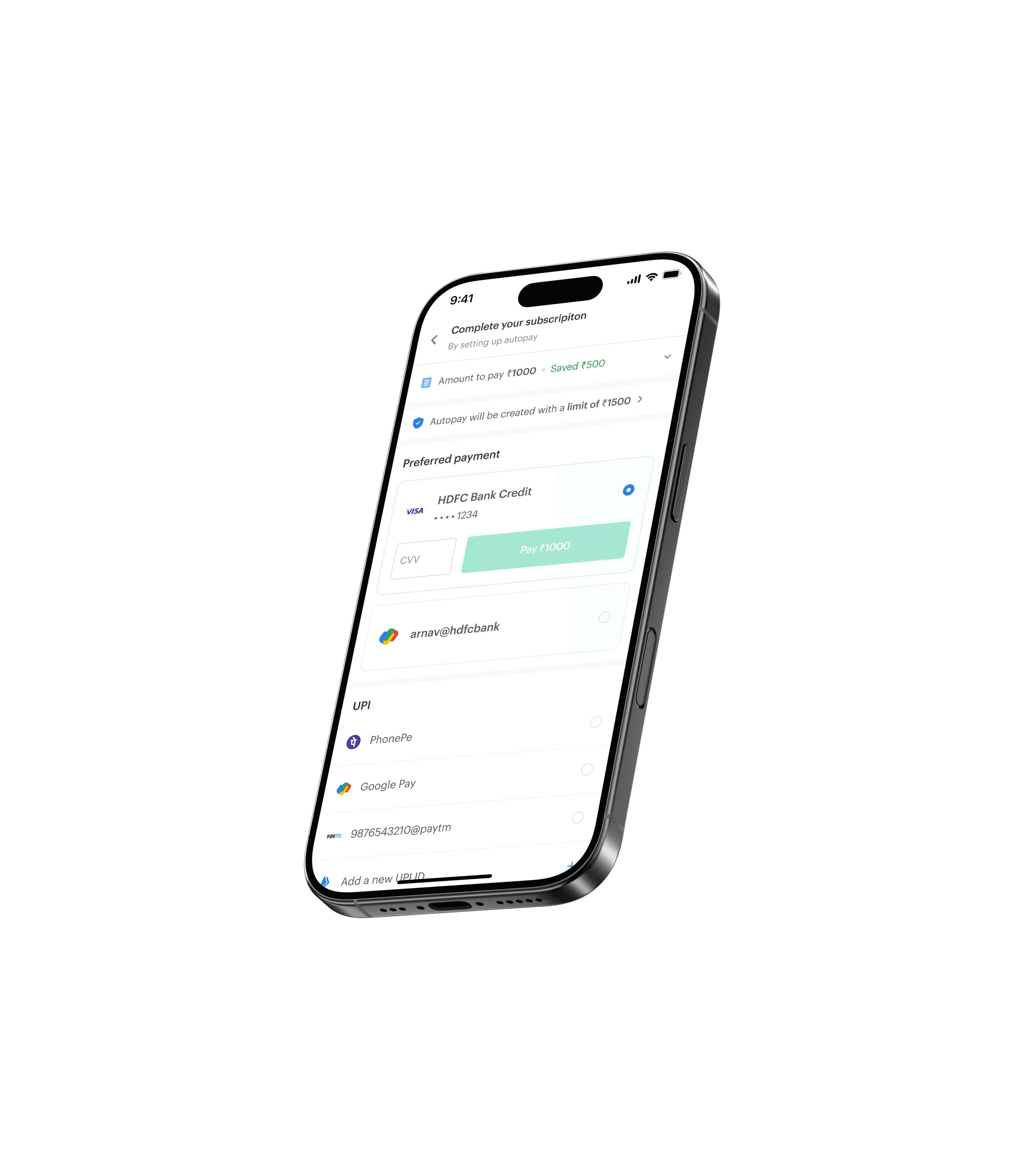
Smallcase Checkout

A customizable payment experience that can be used everywhere on the app!

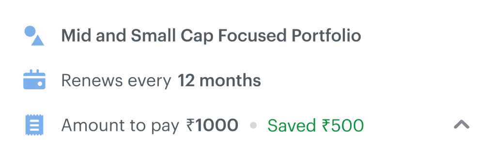
Payment summary tailored to the product you are paying for
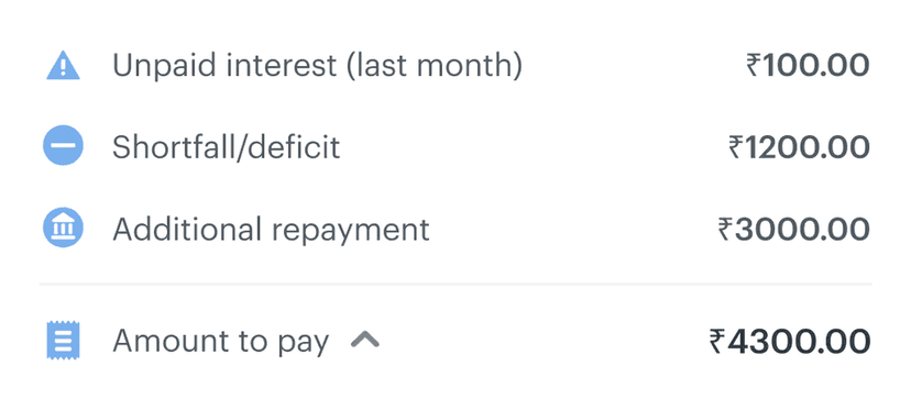
Transparency of how recurring payments are debited

Faster checkout with saved payment methods

Identifying users’ pain points

Through conversations with users and support queries, I found 2 major problems to solve in the payment page...

Reusing payment methods across the app was not possible, increasing average checkout times.

Problem faced by 5/7 interviewees

Reported by 120+ CX tickets

People did not understand how recurring payments for subscription plans worked.

Problem faced by 6/7 interviewees

Reported by 250+ CX tickets

Creating product-based customizability

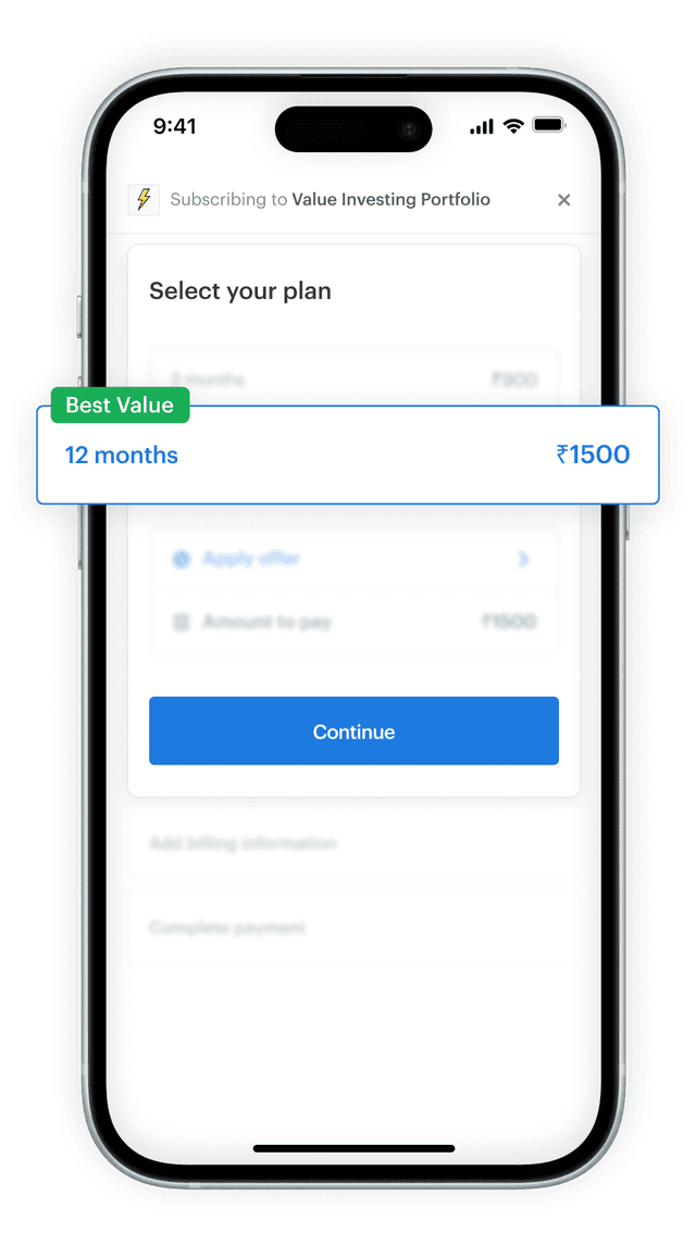
I started by designing the payment summary section with our largest use case in mind – subscriptions.

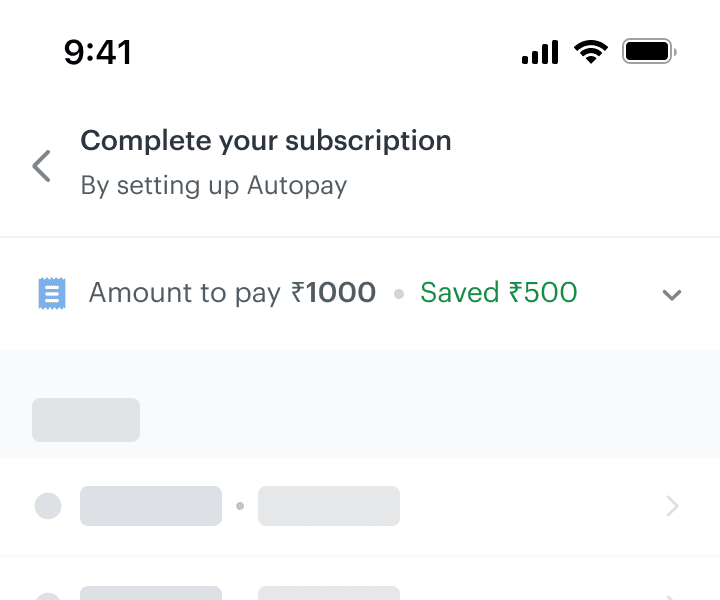
Collapsed payment summary
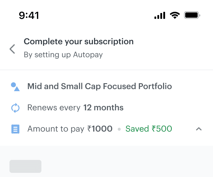
Expanded payment breakdown

As amounts were not always calculated the same way, I scaled this to have 2 variants that can cater to all payment cases.

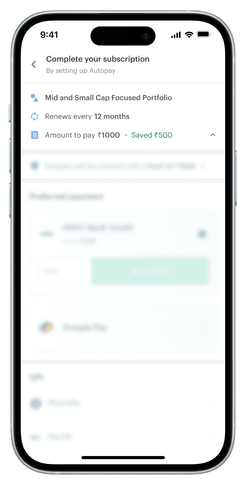
While some use cases have conditional rationale attached to the pricing, others have a more arithmetic breakup. To cater to this, I came up with 2 variants of the component:

List format

When the breakdown is conditional, requires more textual information.

Payment summary in list format

D = (For product A, plan amount for B) - C

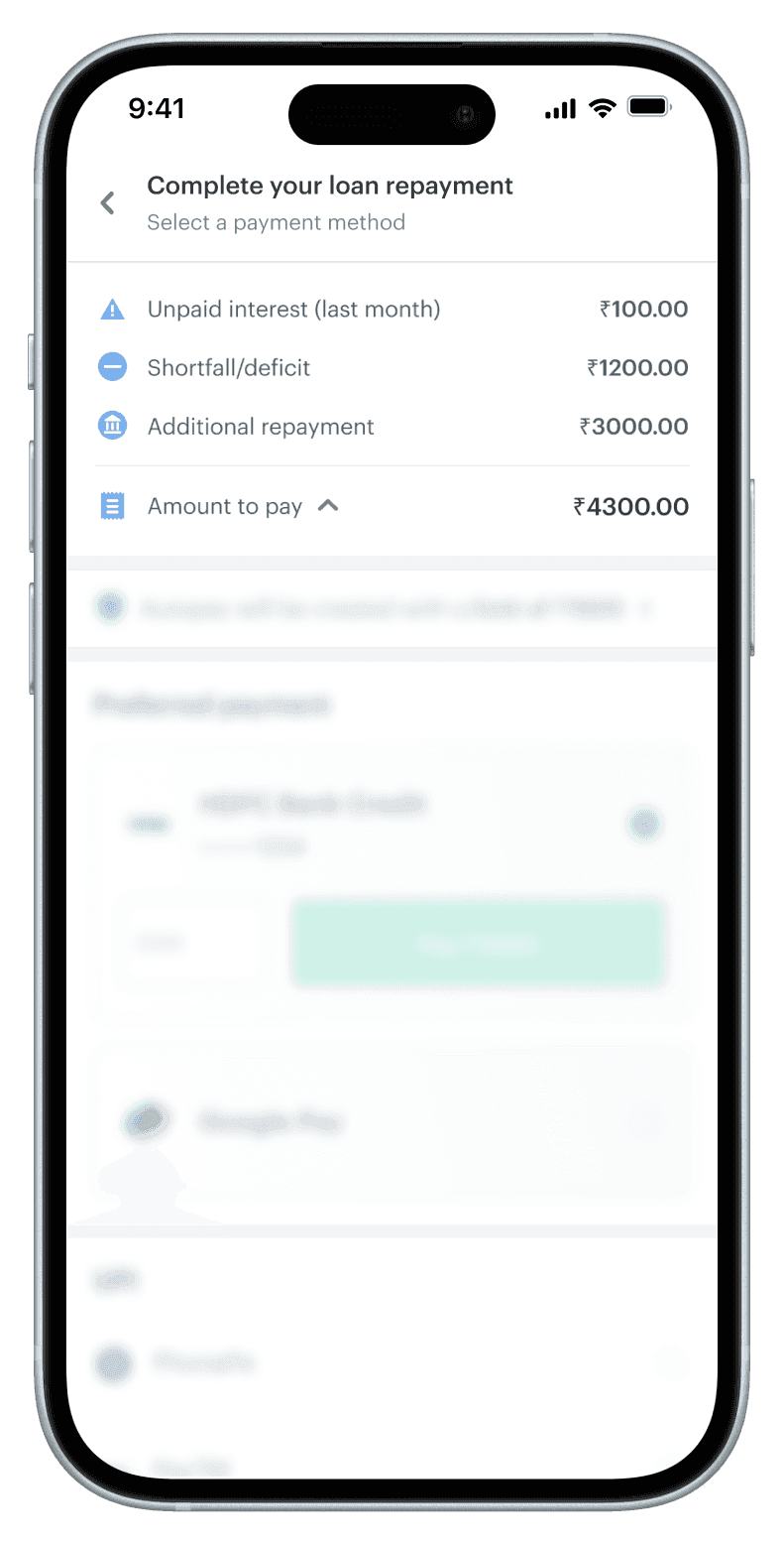
Table format

When the amount is calculated based on addition or subtraction of components.

Payment summary in table format

D = A+B+C

Designing smoother recurring transactions

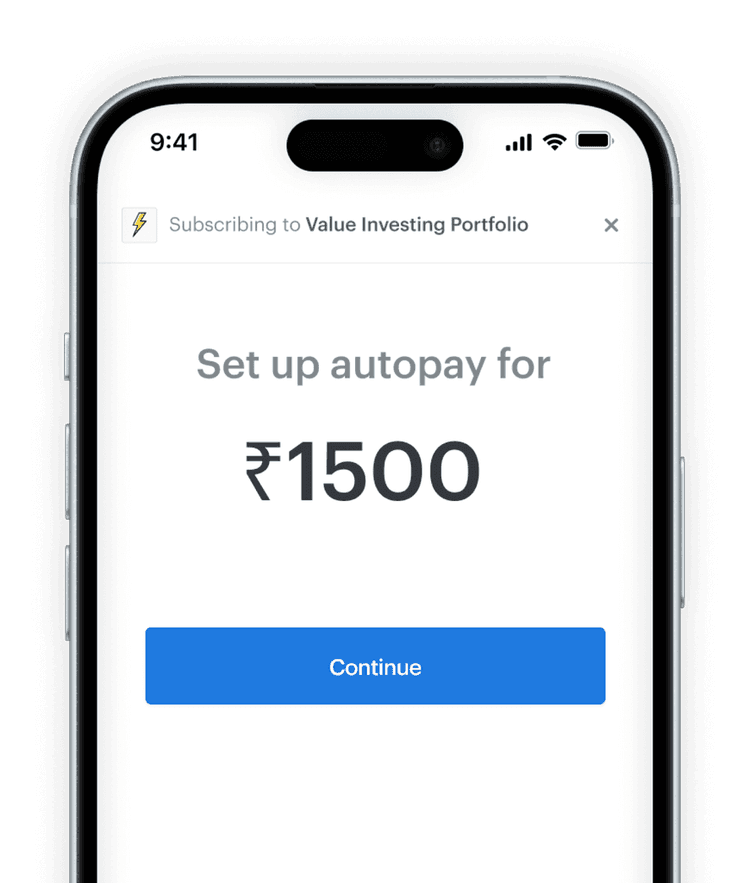
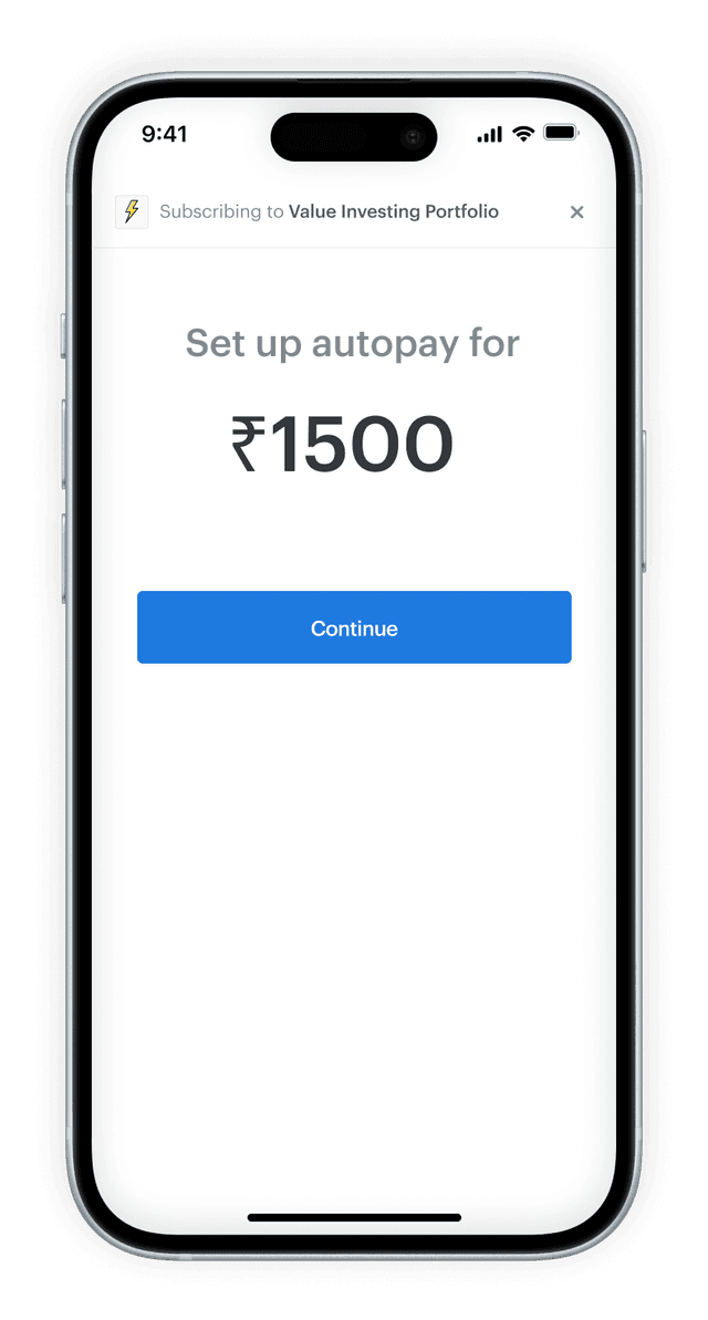
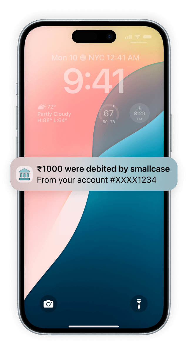
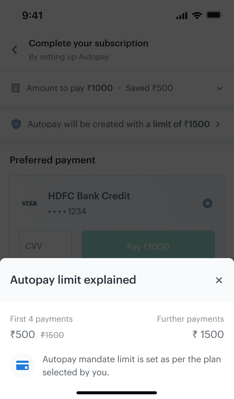
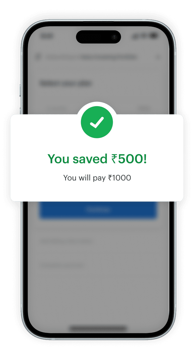
Indian guidelines require you to set a limit on auto-debits to avoid overcharges. But, this caused confusion for users with one-time offers.

“I’ll go for the ₹1500 plan”

“Oh wow, a ₹500 discount!”

31% users dropped off here

“Wait what?! Where did the discount go?”

“Oh okay, they only charged ₹1000”

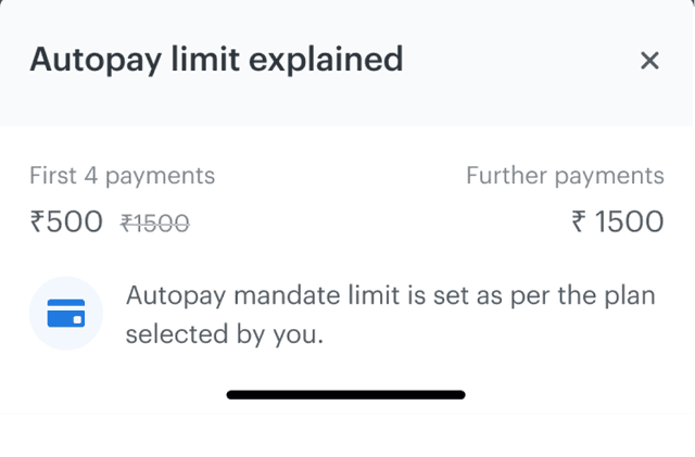
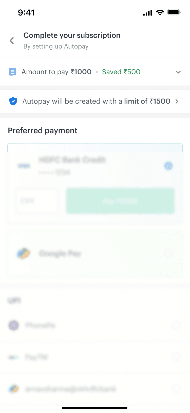
To better communicate this, I included an information bar on the payment page that is transparent about how future debits would occur.

By giving this information it’s own space, we can call out the mismatch before it causes any confusion later.

Information bar below the payment summary
Autopay limit explained in a bottom sheet

Thinking of the returning user experience

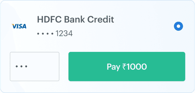
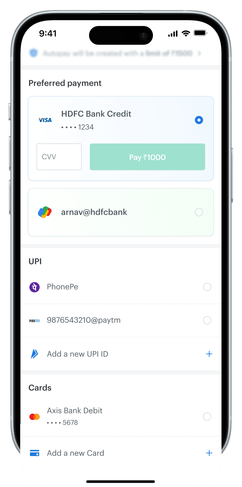
I created a section that shows users their top saved methods based on relevance for faster payment.

Checkout screen with prioritized saved payment methods
Saved methods prioritized based on relevance for faster selection.

Card layout adds emphasis on these methods through color and size.

If you save more than 2 methods, the lesser relevant ones are shown as part of their categories.

Iterating on payment flows

Upon pilot testing initial designs, we found 38% users clicked on one-click methods by mistake.

So, I added intentional friction to reduce the risk of error.

The person selecting the option gets to a second to review their selected option.

Outcomes

The new payment flow improved success rates with a better user experience.

21%
increase

in payment conversions across the platform

34%
decrease

in CX tickets regarding offer missing at checkout

36%
payments

made using saved payment methods